


Black Girls CODE
This web-based dashboard was designed to assist coordinators with the event planning process.
Project Overview
Black Girls CODE builds pathways for young women of color to embrace the current tech marketplace as builders and creators by introducing them to skills in computer programming and technology. The organization has 15 chapters globally, each chapter offers events like workshops, summer camps, hackathons, and code clubs for girls ages 6 and older.
For my UX course, I was tasked with designing a responsive dashboard for a non-profit organization.
Role: UX Researcher, UI Designer
Date: November 2021
Tools: Figma, Miro, Zoom
The Problem
The program coordinators at Black Girls CODE assist with planning events for the 15 chapters of the organization. Because each coordinator plans events for multiple chapters, they find the planning process to be overwhelming and it is difficult to keep everything organized.
The Solution
I designed a responsive web dashboard that helps the program coordinators better manage their events, tasks, donations, and volunteers.
I asked myself, how might I design a product that helps the users manage their events and ease the process of event planning?
Research
For this project, I conducted user interviews and surveys to better understand the organization’s need for a dashboard.
User Interviews and Surveys
I was able to take a look at the Program Coordinator job description. With this knowledge, I had a better understanding of the user and some of their daily tasks.
I wanted to learn more about Black Girl CODE events and the users’ event planning process. Here are a few questions I asked during the interviews:
What information do you need to know when planning an event?
How do you currently manage events? Do you manage multiple events at once?
Do you utilize a checklist? If so, what is on it?
What do you do on the day of the event? During the event? After the event?
I also conducted a survey to help me understand what information was most important to include on the dashboard.

Dashboard Research
Because the goal of this project is to design a dashboard, I looked at some examples of dashboards and found information about how to design a dashboard. I learned:
Dashboards are meant to be gateways to further information. Show a snippet of the most important data point upfront and allow the user to drill down further if they wish to.
Show actionable insights, not just data.
Cognitive psychology proves that the human brain can’t process a vast scope of information at the same time. Our scope is rather limited, which makes minimalism your very best option.
Research Findings
Based on the user interviews, I would need to include the following on the dashboard: event status, task priority, upcoming events, add a task, and donation and donor information.
From my research, I also gathered that:
Users like to know the status and priority of the event, project, or tasks they are working on, so they can quickly see what needs to be completed.
They want to view upcoming events.
Users want to ability to quickly add a task for the events they are working on.
Some users mentioned they can assign the task or event to someone in the organization if they cannot lead the event the day of.
Being able to track attendance and event feedback helps determine the success of an event.
User Persona
Meet Talia Harrison! I created her based on the user research and job descriptions.
Define
I wanted to design the dashboard for everyday use, that will help the user manage events and complete their tasks.
Site Map
Task and User flows
When creating a task and user flow and defining the dashboard features, I referred back to my user persona and user surveys.
UI Design
Once I created my screen design requirements, I began by sketching various layouts for each screen and eventually turned them into UI designs for user testing.
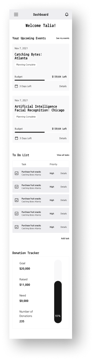
For this project I needed to create a mobile version of the dashboard, allowing users to access the information in any environment.
My goals for the designs are:
Needs to be easy to navigate, so the user can quickly find what they looking for.
Clean and simple, the information presented on the dashboard should be the main focus.
The style of the interface should match or complement the website.
Sketches
Wireframes
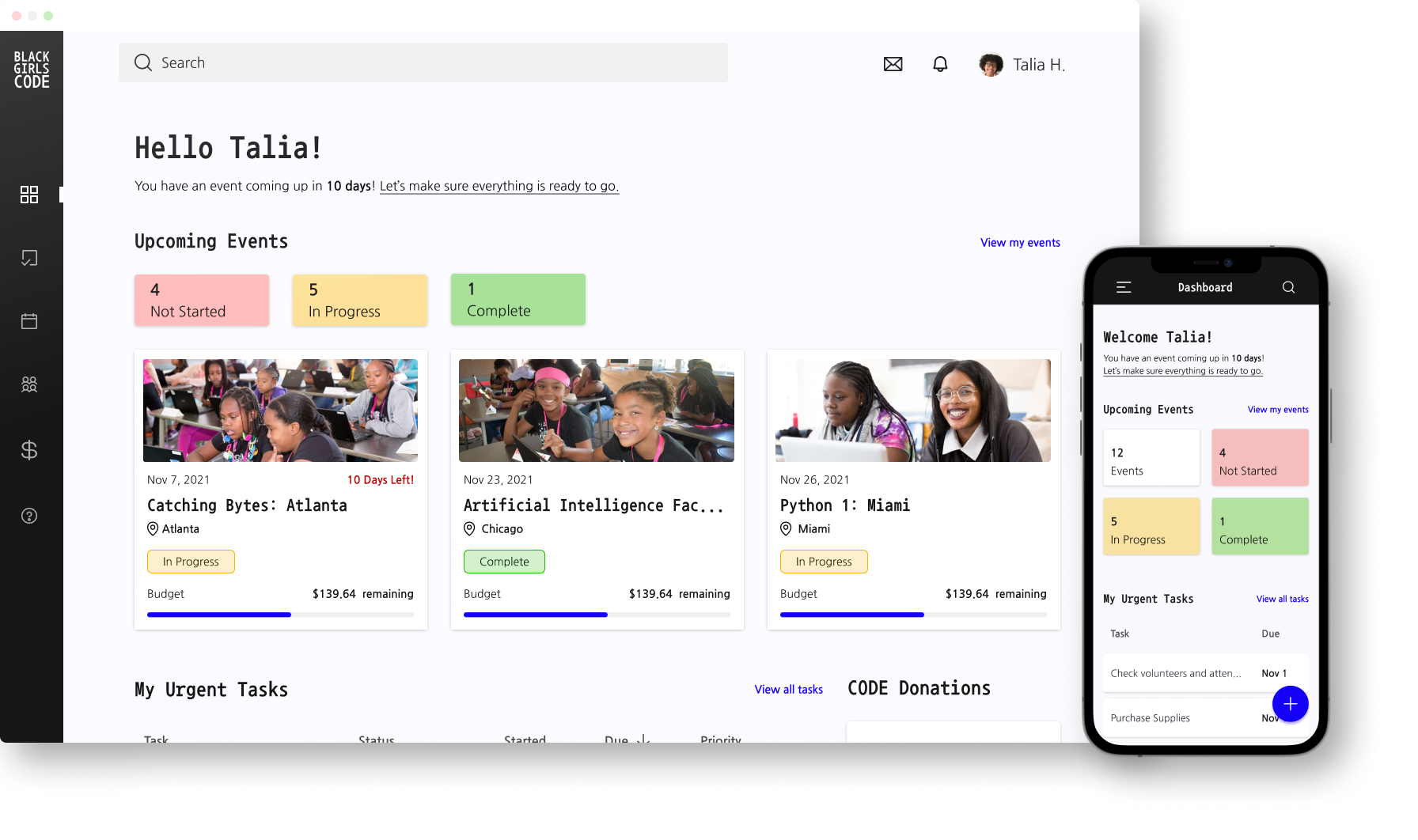
Dashboard/Homepaage
Mobile Dashboard
Style Guide
Because I designed this product for Black Girls CODE, I used their website as a style guide. Their website has a dark mode style, utilizing dark as well as vibrant colors. This dashboard will be for everyday use, and a dark interface may be harder to see if users are in a well-lit environment. However from my studies, some users prefer a dark mode, so I wanted to give users the option between light mode and dark mode.
Light Mode
Dark Mode
Usability Test
After applying the style guide to the wireframes, I needed to test the product to determine if it was easy to navigate and if the design flow made sense to the users. I used Figma to create the prototype
Participants were asked to complete 2 tasks:
Add an item to the budget of a specific event.
Navigate to the tasks of a specific event.
Usability Test Results
Participants were confused or hesitant at the beginning of the first task. They needed a moment to think about how to add juice to their event budget.
Each participant found the second task easier to complete because they were more familiar with the product and knew where to look.
Two participants did not initially see the “view details” button on the event card. They thought they could click on the card itself or click on the event title to navigate to the event’s details.
Participants liked seeing the red, yellow, and green status colors, they said it felt familiar.
For the first task, none of the participants clicked on the add button while on the main dashboard page. One participant was not expecting to be able to add an item to the budget from the dashboard. Her thought was to navigate to the page where she needs to add an item, then click on the add button.
Iterations
Based on these findings, I made the following iterations:
Added a help page
Rename the To-Do List on the Dashboard
Removed the “view event” link and made the event card a button.
Added “new event”, “new task”, and “new purchase” buttons on their respective page.
If given more time, I would have like to create a small tutorial, for new users to help them figure out how to navigate the product.
The Final Design
Take a look at my final prototype and designs!
Dashboard/ Homepage
Dashboard - Dark Mode
Events
Event Details
Event Tasks
Event Budget
Takeaways
This was my first time designing a dashboard, so during my research I learned about designing dashboard elements and the user experience when interacting with dashboards. I learned, it is best to display the most important information on the dashboard, while the more detailed information can go on the other pages of the interface. I found It may benefit the user to keep the design simple/minimalist, so it does not distract from the information being presented.
Take a look at my other projects!

What’s in My Fridge?
An AI-powered refrigerator inventory app.

Intra CSP: Client Mangement
Designing a SaaS web portal.
Target: Scan & Go
A new feature for the Target app.